Chase Brexton Health Care
Made at idfive
Campaign / Digital Design / Social Media / Print / Motion Design

challenge
Chase Brexton provides compassionate, quality health care that honors diversity, inspires wellness, and improves communities. They are a non-profit network of five Maryland-based clinics that has extended from the flagship location in Mount Vernon. They are well known among Maryland’s LGBTQ community as providers of gender-affirming care, as well as a reliable option for low-income families and individuals. Many people in Central Maryland aren’t aware of the availability and breadth of Chase Brexton services for their healthcare needs, and could have misconceptions about what they provide. With this in mind I had to consider a means to build a visual presence that gave new life to proving how Chase Brexton provides healthcare services to all walks of life.
My role
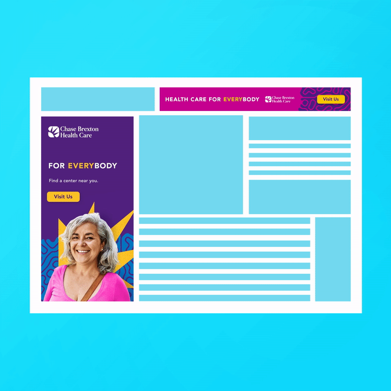
Focus from the get go revolved around developing a distinct general audience-focused design to raise brand awareness and to redefine Chase Brexton’s visual identity in a manner that felt captivating and purposeful. Reviewing the brand colors, it became apparent quickly that they had a range of bright, vibrant colors that when following a system for application could provide both an eye-catching and professional presence without remaining within the status quo. Focusing in on patients by putting them first within the ads and tying back into the campaign headline “Health Care for EVERYbody” allowed for the designs to highlight Chase Brexton’s mission of providing compassionate care for all their patients. Through the use of a pattern inspired from fingerprints allows us to tie back to our identities and those we touch in life. I handled concepting and taking lead on designing out all the digital, out-of-home, and social media assets from start to finish.
Out-of-home Live Examples

Bus Shelter Poster, Baltimore, MD

Large Digital Billboard - Penn Station, Baltimore, MD
Concepting / Process

Moodboard / Inspiration
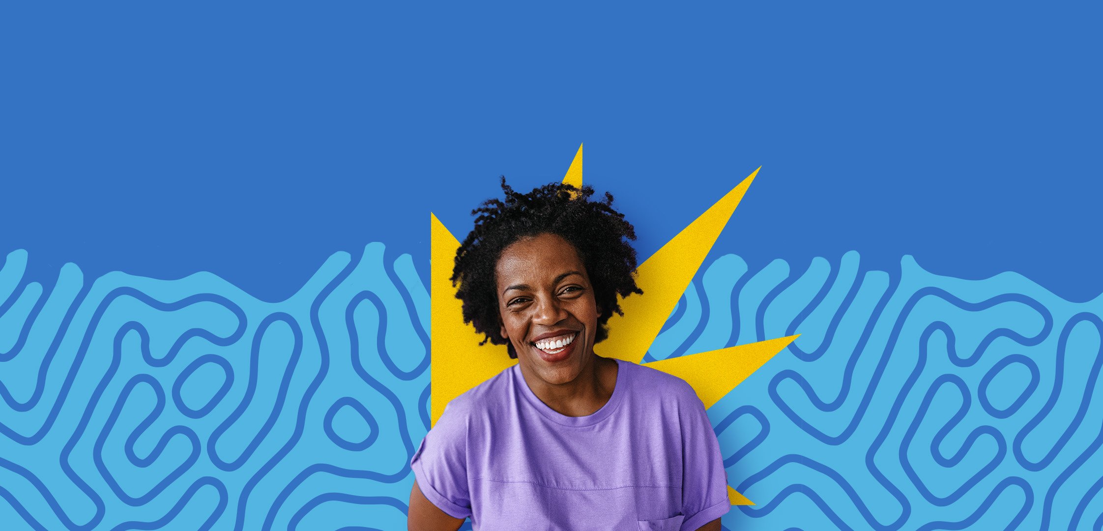
Sunburst

The placement of the abstract Chase Brexton Sunburst from the main logomark directly behind the person/patient helps to amplify the message that Chase Brexton is committed to individualized care and meeting each patient’s unique needs. Hitting home the highlight YOU + Chase Brexton approach to the campaign.


Pattern
The pattern is purposefully organic and vibrant, drawing inspiration from fingerprints in a whimsical nod to individuality. Each patient has their own unique bodies, personalities, and needs—and I wanted to find a means to capture that subliminally.

Color Pairings
Chase Brexton provides a wide array of healthcare services for a patients’ varying needs and they are committed to diversity. So it only makes sense for their brand colors to speak on the same level. This presented me with a challenge to simplify color use and to establish a color system to be applied across their general market assets. Making sure to take into account ADA compliance for all text applications.